
Cigarette Pack Design: Does It Really Reflect Lifestyle?
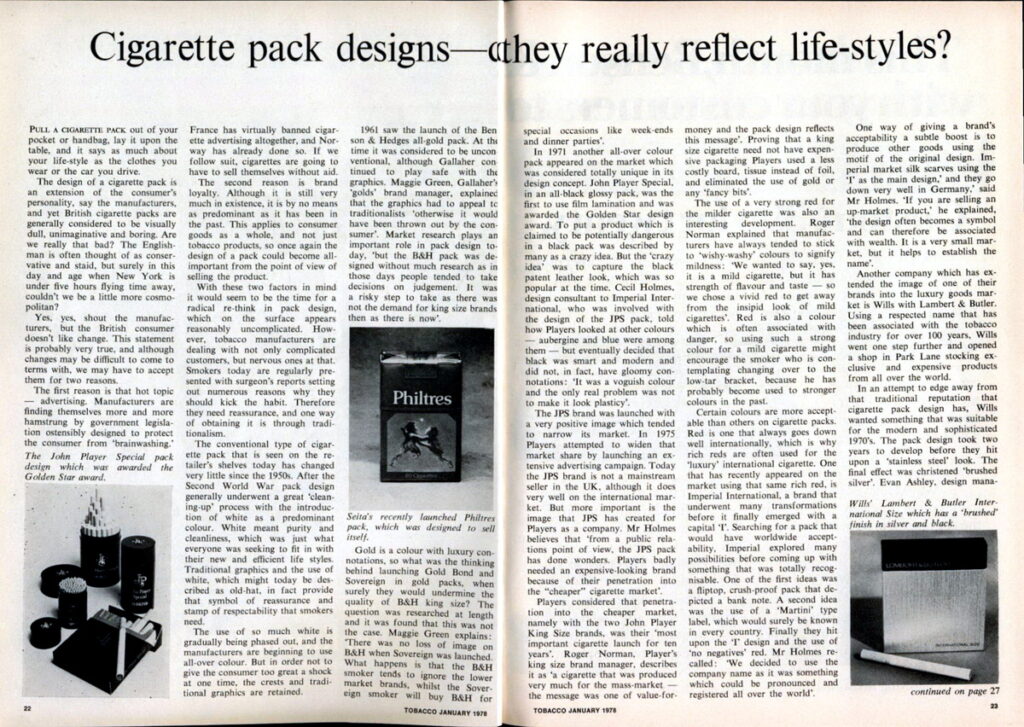
Adapted from Tobacco magazine, No. 1, 1978.
Take a cigarette pack out of your pocket or bag, set it on the table, and it may say as much about your lifestyle as the clothes you wear or the car you drive.
Manufacturers have long argued that cigarette pack design is an extension of the smoker’s personality. Yet many packs have often been criticized as visually dull, bland, or overly cautious. In a market shaped by style, identity, and first impressions, that raises an obvious question: should packaging do more?
The old industry argument was that smokers did not like change. That may have been partly true, but two major forces pushed packaging design into a more important role.
The first was growing pressure on tobacco advertising. As regulations tightened and promotional options narrowed, packaging had to carry more of the brand’s message on its own. If external advertising became limited, the pack itself had to do more of the selling.
The second was shifting brand loyalty. While loyalty still mattered, it was no longer as automatic or dominant as it had once been. That meant pack design became even more important as a point-of-sale tool and a visual signal of quality, identity, and value.
With those factors in mind, the case for rethinking pack design became much stronger. What looks simple on the surface is actually a balancing act between familiarity and novelty. Smokers often respond to reassurance, and traditional design elements can help deliver that sense of confidence.
The standard cigarette pack seen on store shelves changed very little from the postwar era into the 1970s. After World War II, packaging in many categories went through a visual cleanup, and white became a dominant color. It suggested cleanliness, order, and efficiency—qualities consumers strongly associated with modern life at the time.
Traditional graphics combined with white backgrounds, which may look conservative today, once served as symbols of confidence and respectability. For many smokers, those cues reinforced trust in the product and the brand.
One major break from that tradition came with the all-gold Benson & Hedges pack, introduced in the early 1960s. At the time, it was seen as unconventional, even bold. The design succeeded in part because it kept a premium feel while still remaining recognizable and acceptable to smokers who were not ready for radical change.
Gold naturally carries an association with luxury, so using it across multiple brands raised questions about whether it might weaken the premium image of an established flagship product. The thinking at the time was that it would not. Smokers of higher-end brands often ignored lower-priced lookalikes, while smokers of more affordable brands might occasionally trade up for special occasions.
Another major packaging shift arrived in the early 1970s with John Player Special and its high-gloss black pack. The look was considered radically different and drew attention for its use of film lamination and its sleek, fashion-driven appearance. To some, putting a tobacco product in a black pack seemed risky, but the black finish was meant to echo the polished, luxury look popular in design at the time.
That pack gave the brand a sharply defined image, though one that also narrowed its audience. Even so, the design had value beyond sales alone. It helped create a more upscale image for the company behind it, proving that one strong package could elevate perceptions of an entire portfolio.
At the other end of the market, value brands took a very different approach. Their packaging emphasized practicality and affordability rather than glamour. Lower-cost board, simpler inner materials, and the absence of decorative details all reinforced the message that the smoker was getting straightforward value for money.
Color also played an increasingly strategic role. One notable shift was the use of strong red on lighter-style cigarettes. For years, softer or washed-out tones had been used to suggest mildness, but brighter red offered a way to communicate that a lighter cigarette could still project richness, flavor, and presence on the shelf.
That choice worked because color carries memory and association. Smokers who were considering a switch within a category might still be drawn to familiar, bolder tones rather than packaging that looked too subdued or generic. In that sense, design could reduce the sense of compromise and make a new product feel more acceptable.
Pack Design as Brand Strategy
The broader lesson from these examples is that cigarette packaging has never been just a container. It functions as branding, signaling, and retail communication all at once. In categories where advertising faces restrictions, the pack becomes even more central to how a product is recognized and remembered.
Design choices such as color, finish, typography, and materials all send messages about price, quality, taste, and identity. Whether the goal is to project luxury, value, tradition, or modern style, the package often does the talking before the product ever does.
Bottom line
Cigarette pack design has always reflected more than simple packaging needs. It communicates status, taste, familiarity, and brand positioning in a way few other elements can. As advertising options narrow and shoppers make faster decisions at retail, the pack remains one of the most powerful tools a cigarette brand has.
Important: This article is presented as a historical and design-focused adaptation of a 1978 trade-magazine piece. References have been edited for a U.S. audience, and the content is intended for discussion of packaging, branding, and tobacco-market history.